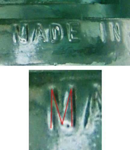
CD 162 HEMINGRAY "NADE" embossing error (analysis)
By Bill Meier; posted November 10, 2007
View Original: Click to zoom, then click to magnify (442 x 511) 37KB

|
First, this is the "stamped" type embossing. Each character is always neatly formed. I do not see that with this "N". It looks wrong... If you look at this picture, you will see that the diagonal stroke from the left upper vertical edge of the M down to the right, does not meet the vertical bar of the other leg at the bottom as it would if it was a true N. In fact, if you look closely, I believe it does stop in the middle, between the vertical legs, as it would for a "M". I have traced what I see as the outline of the letter in the lower photo. What I believe happened is that a small piece of the mold between the diagonal of M and the right bar of the M chipped out, and created this. As you can see, the embossing on that side of the M is thick. It is common for little pieces of the mold to chip out, especially around the embossing. I see it all the time where a little chunk comes out between the I and N in HEMINGRAY, and you sort of get a real fat looking left leg on the N. If this was a true embossing error, i.e. a N stamped in the mold rather than a M the N would be clear and well formed. Compare this "N" with the true stamped "N" to the right in "IN" - they should be identical if this was a stamped N. I do not see this well formed N, and thus propose the above as the explanation. |